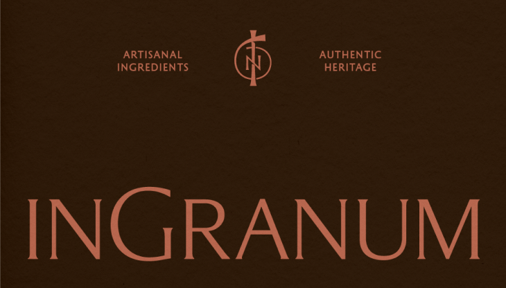
InGranum
Scope:
Branding
Visual Identity
Packaging
Digital
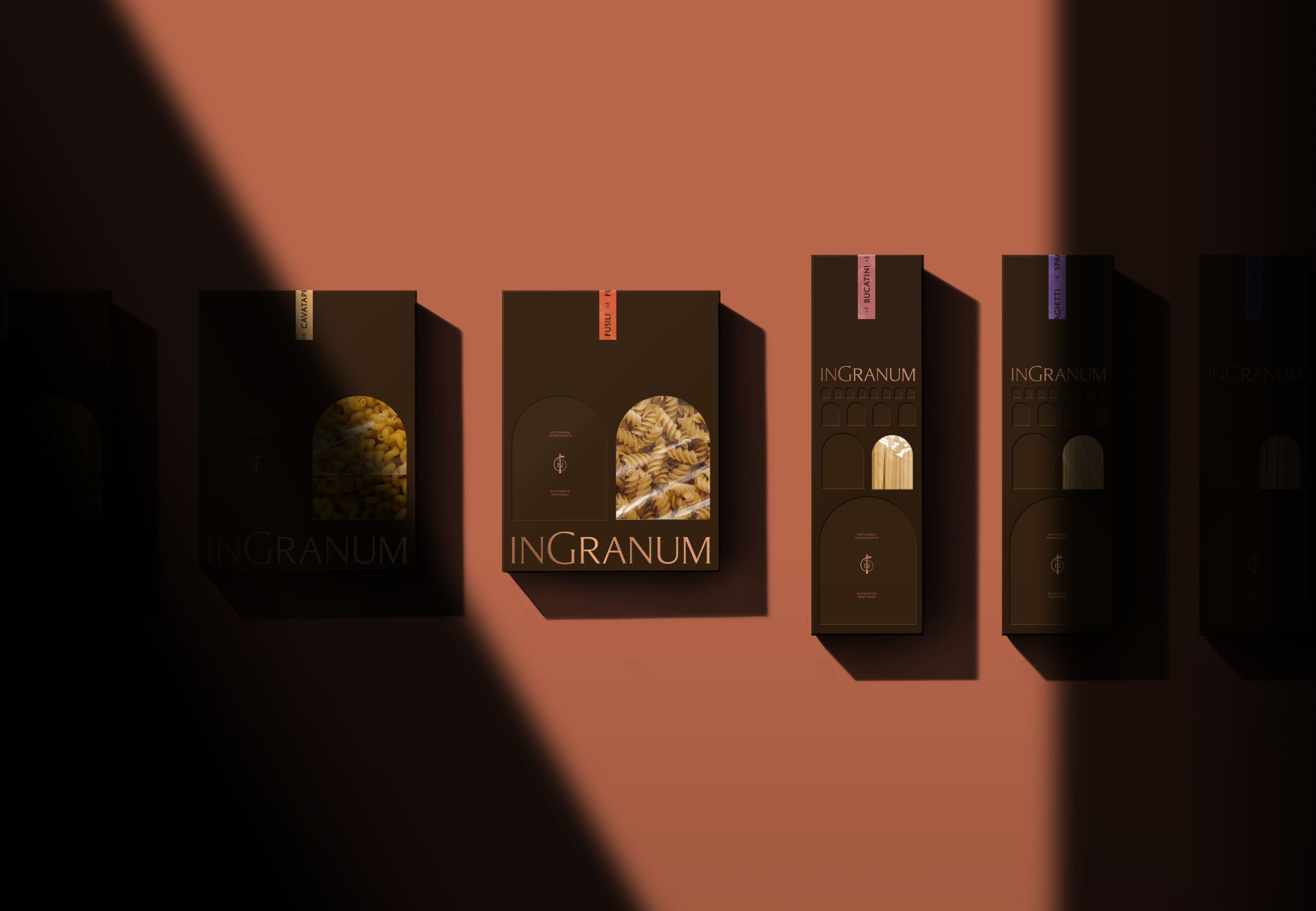
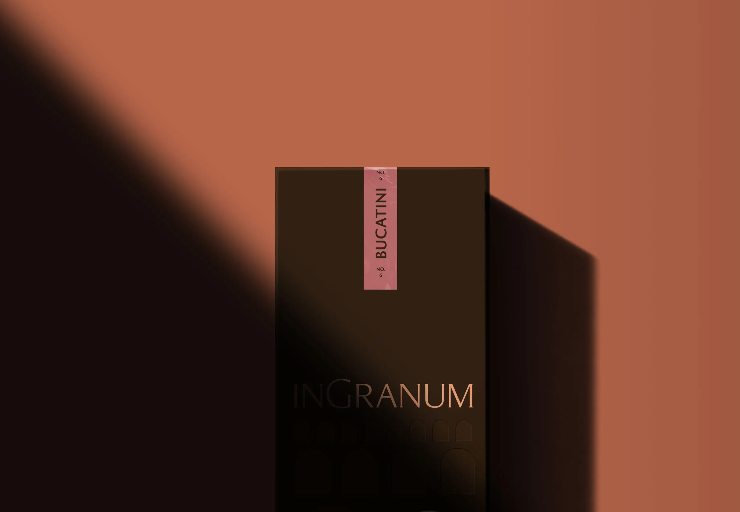
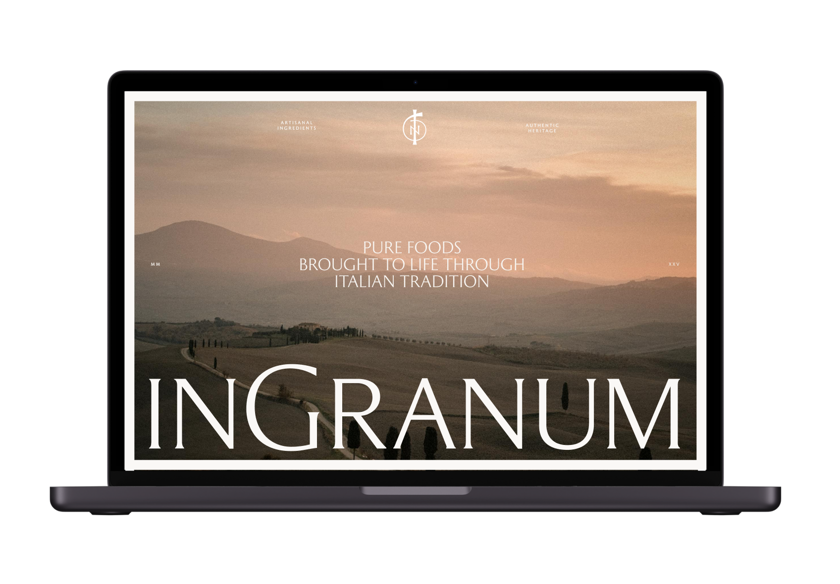
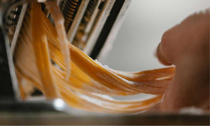
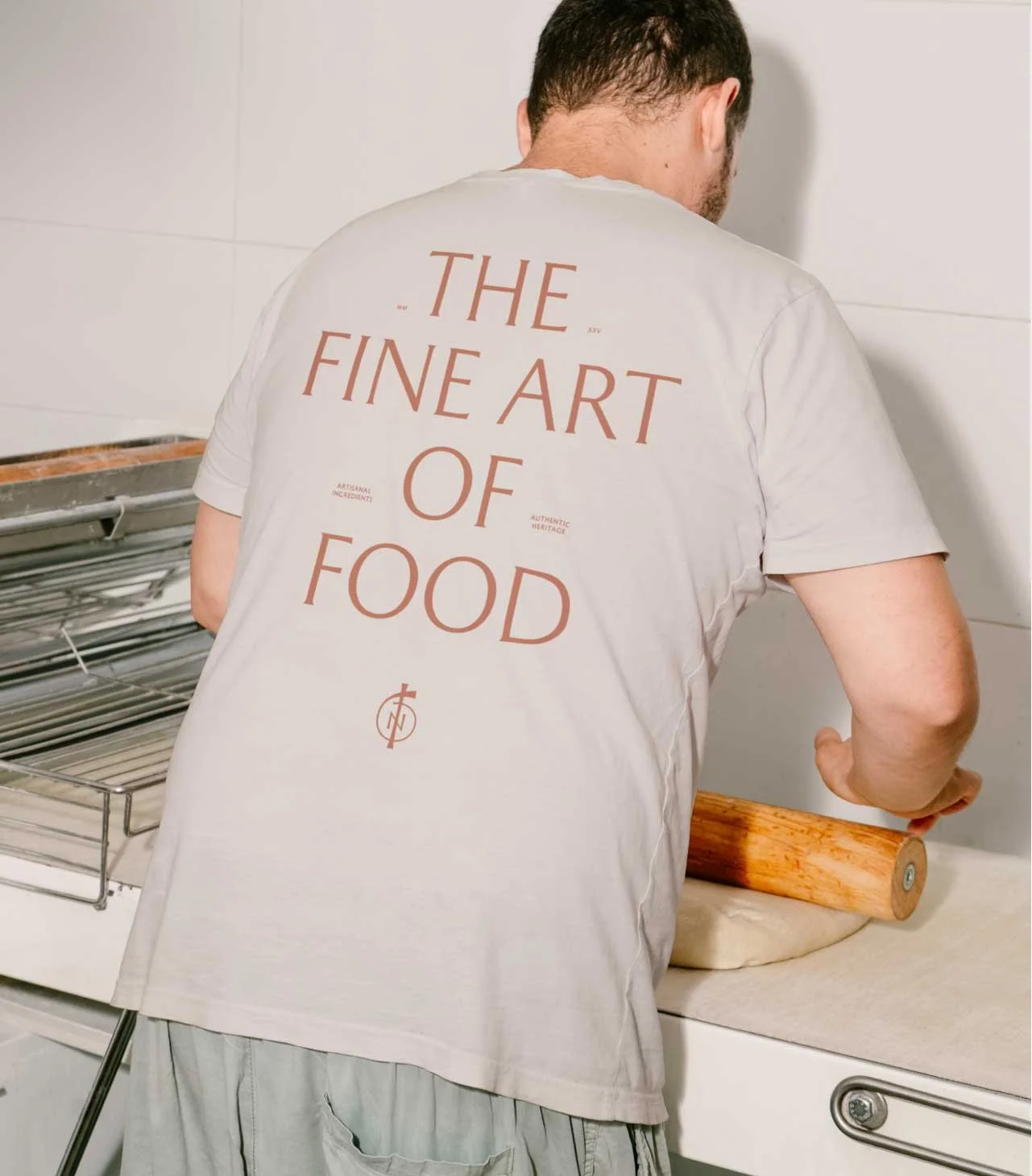
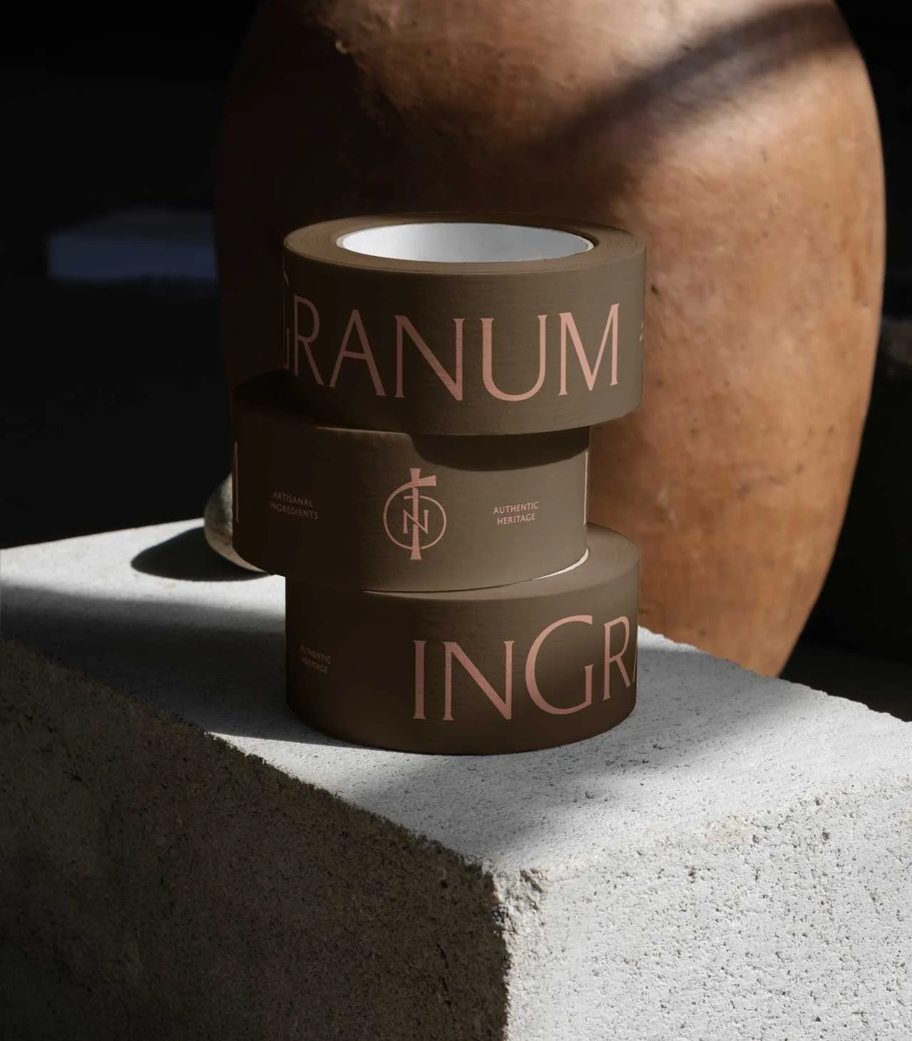
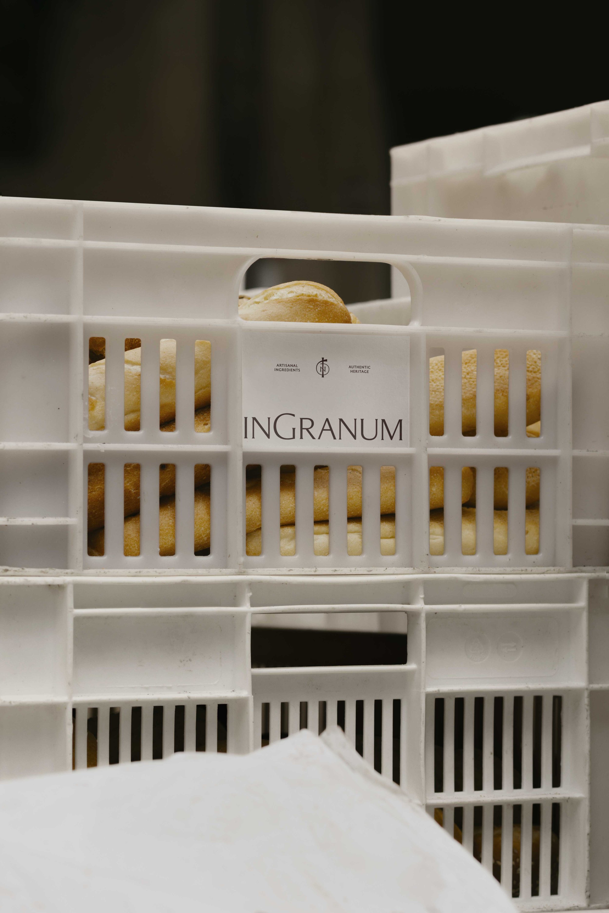
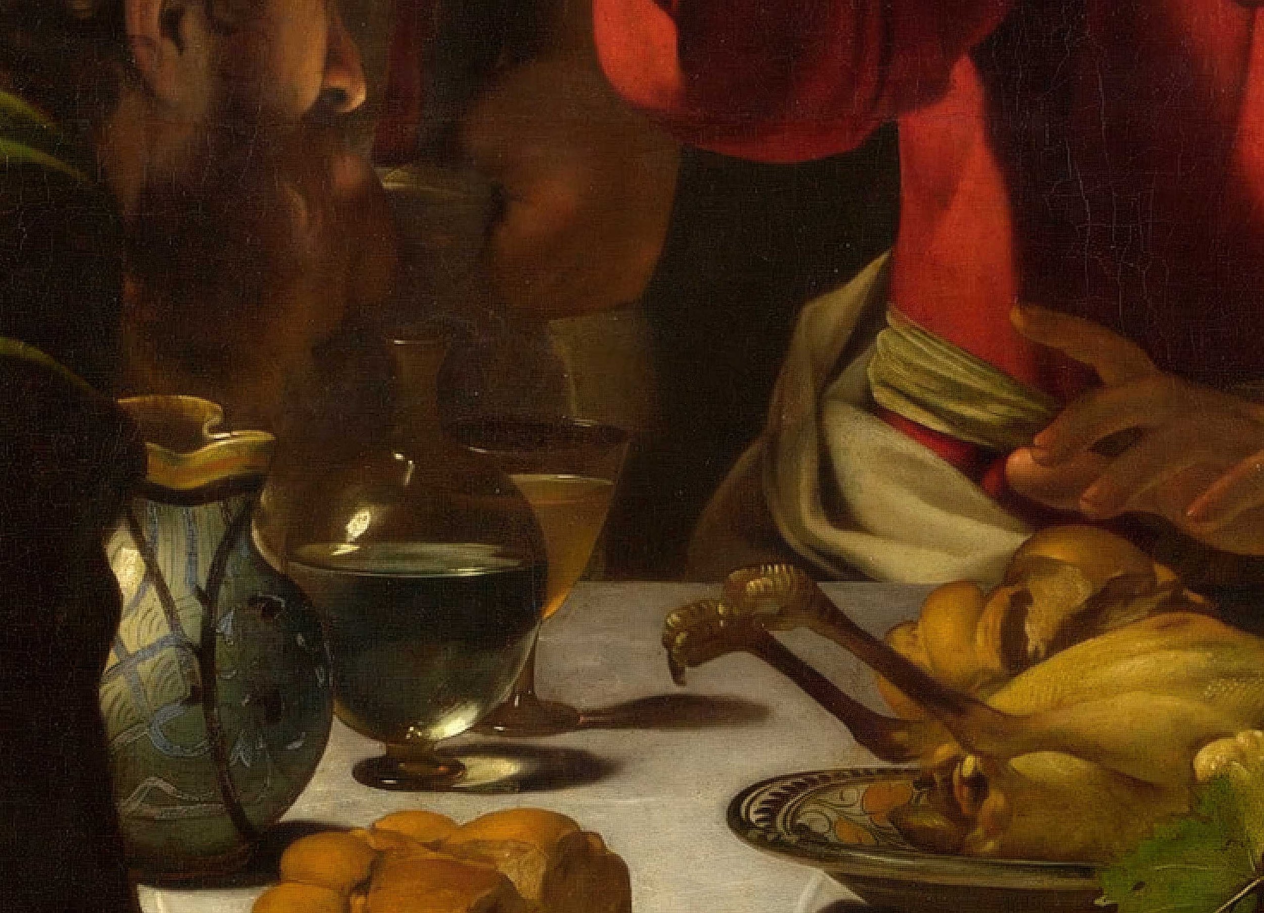
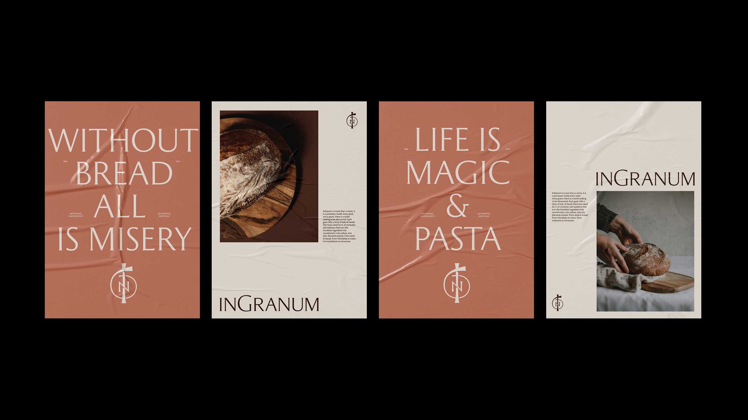
→ InGranum is a commercial bakery that brings authentic Italian baked goods and pasta to restauranteurs, businesses, and communities through the timeless tradition of arte bianca. They asked for an identity that would reflect the premium nature of their offering, connect to the simplicity and integrity of their ingredients, while paying homage to their deep reverence for traditional methods.

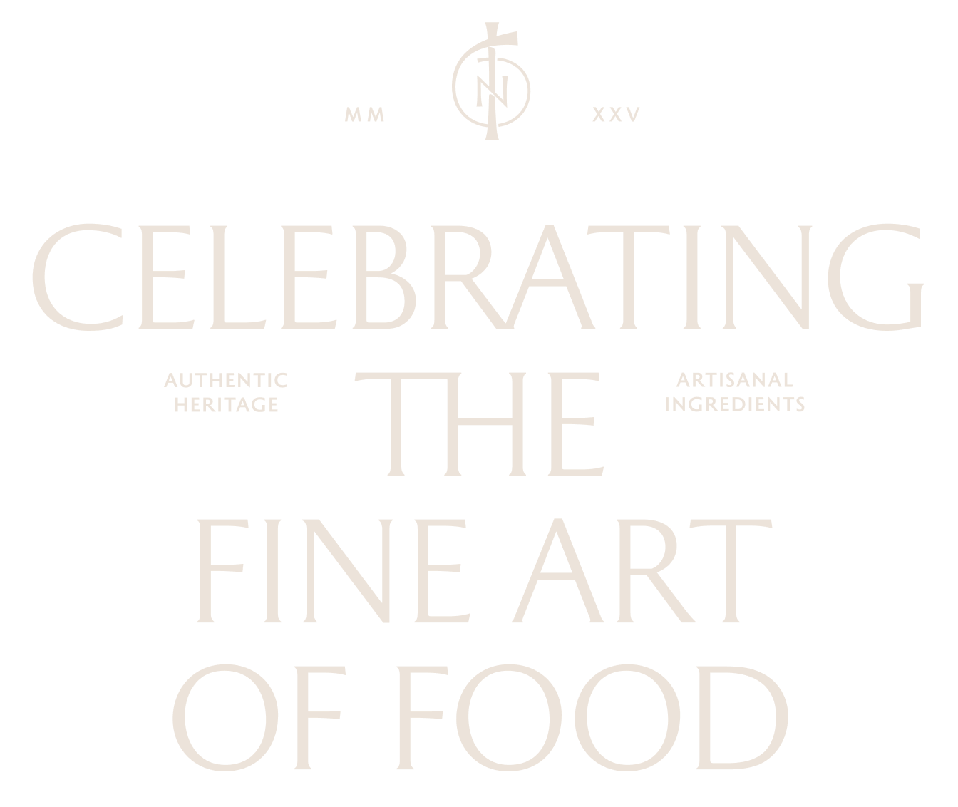
Using a customized version of Garda Nova, this logotype updates classical Roman letterforms for a modern context, achieving a timeless sense of elegance.
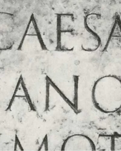
Fig 1:
Capitalis Monumentalis
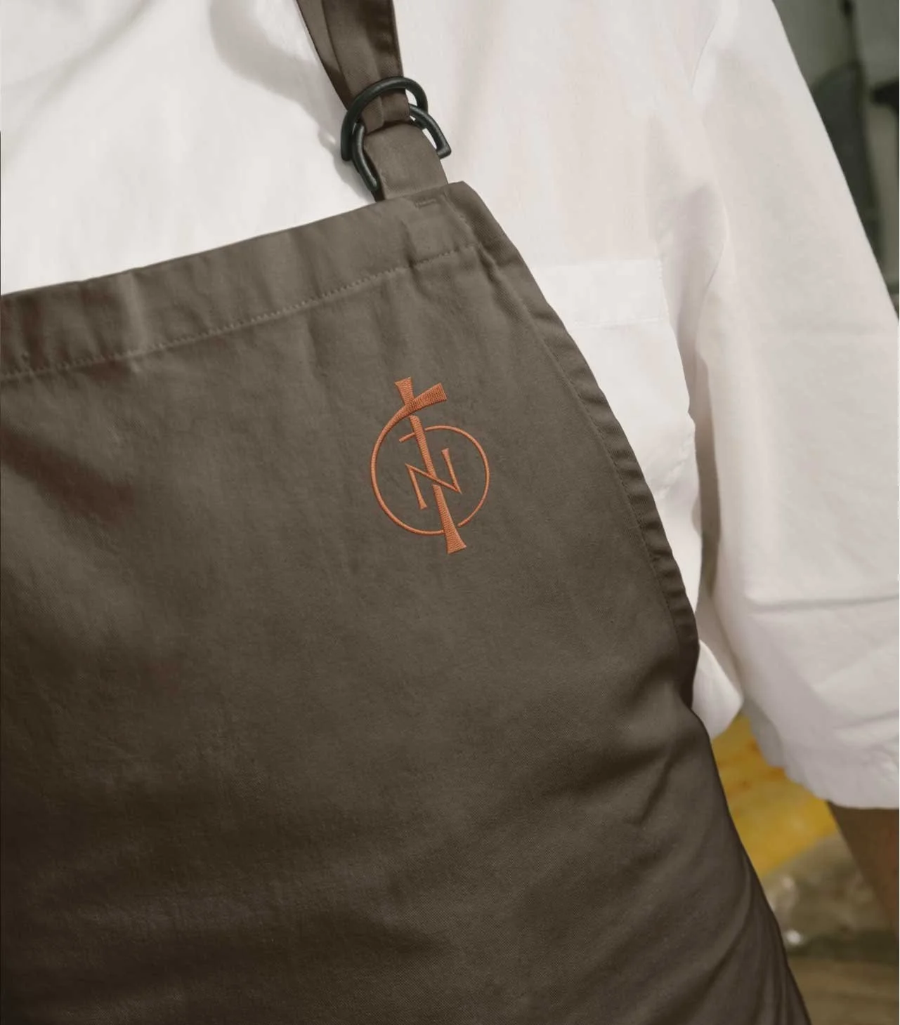
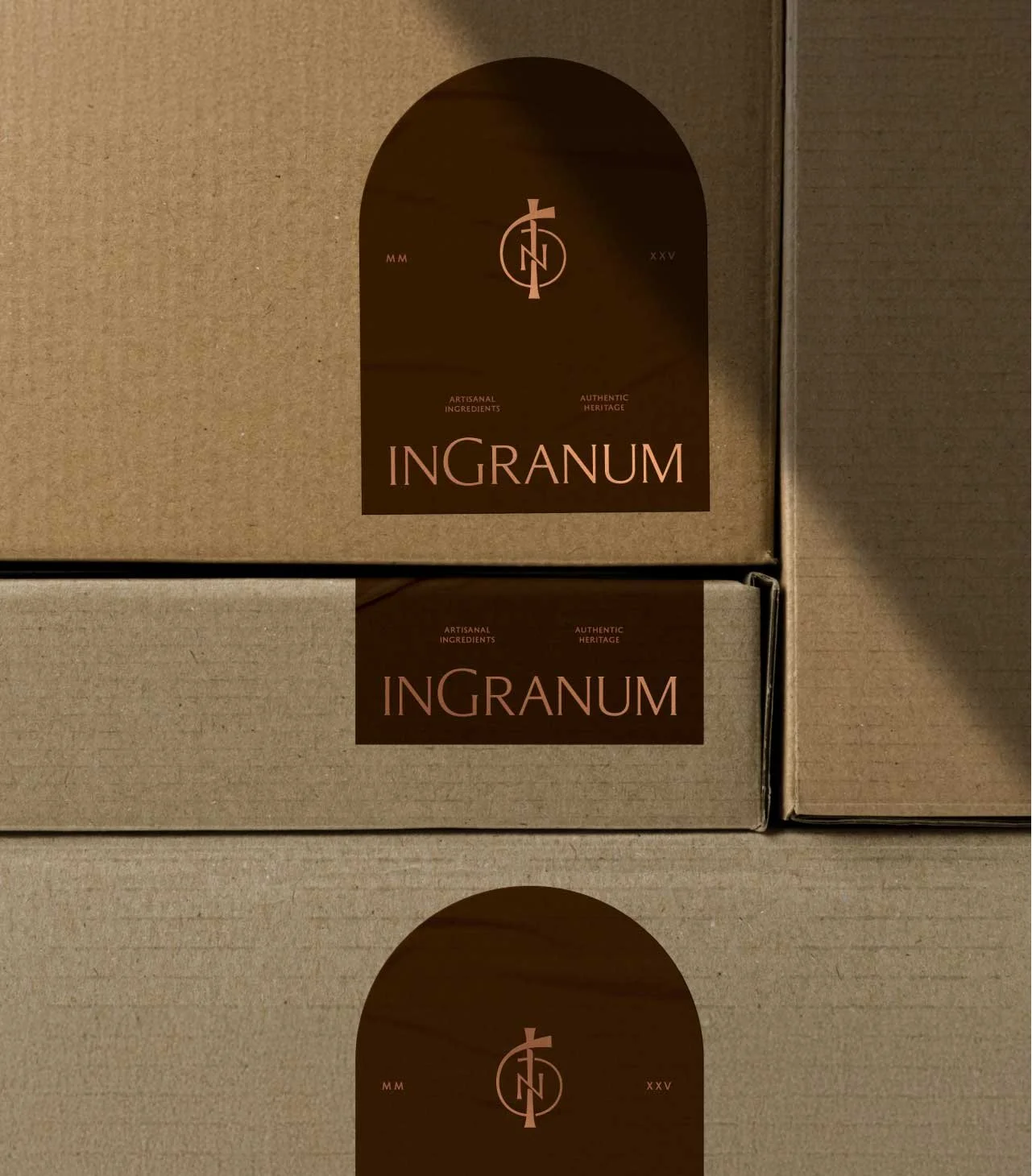
Artists and craftsmen have long used monograms as a “maker’s mark” to confirm the veracity of the item’s quality and origin.
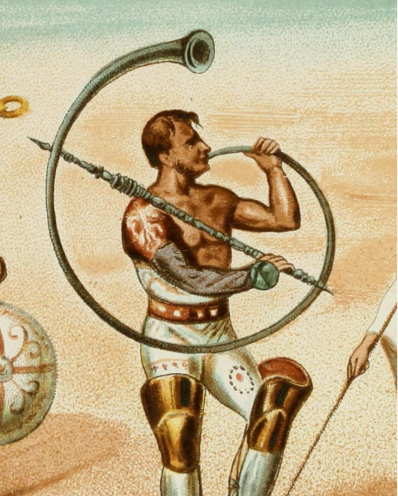
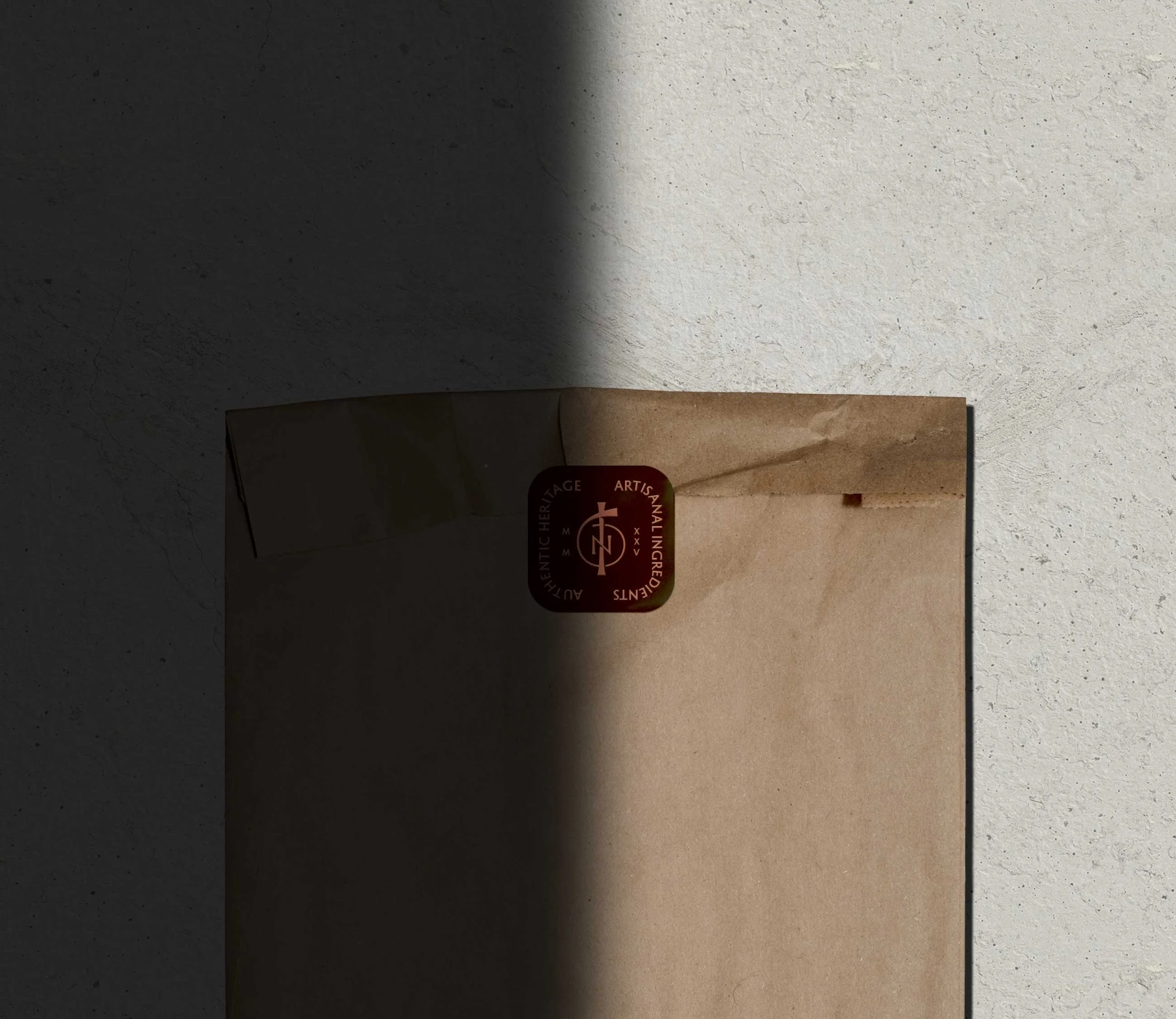
Fig 2:
The Cornu
The mark is inspired by the Cornu — an ancient Roman instrument in the shape of a letter ‘G,’ with by a crossbar that stiffened the structure and provided a means of supporting its weight.
Fig 3:
The Maker’s Mark

This quintessential feature of Roman architecture offers a framework for shape within the brand system.

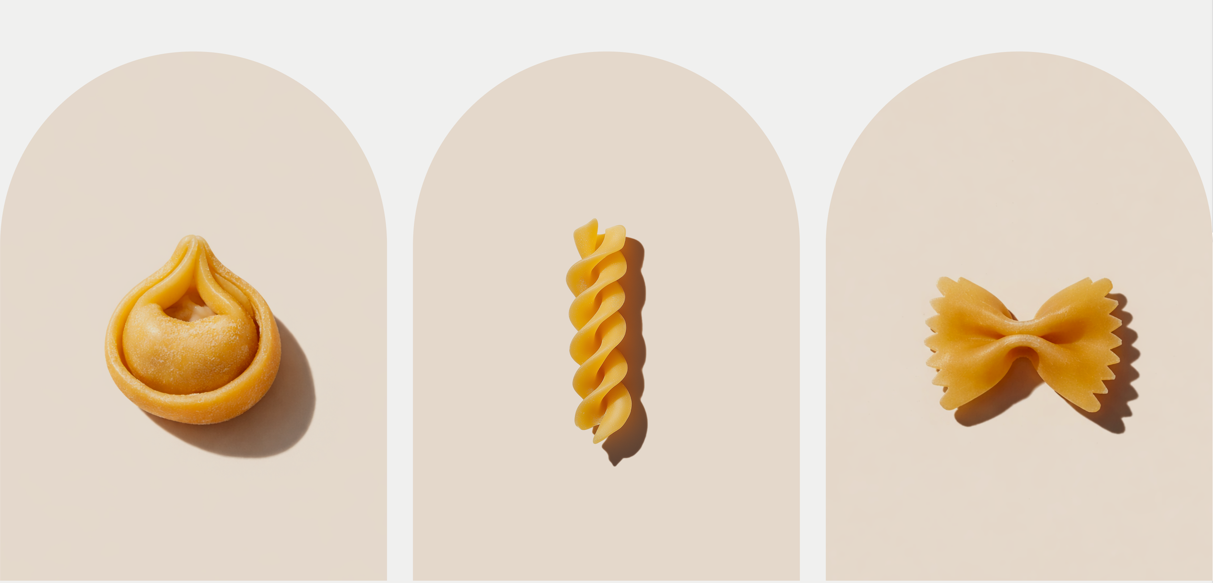
Fig 4:
The Arch